The objective
After purchasing property in the Bay Islands, a client needed help building a brand from the ground up.
creative direction: Bernie Deshaies & Hope Walsh
art direction: Bernie Deshaies
design & illustration: Bernie Deshaies & Hope Walsh
photography: Bernie Deshaies
copy: Autumn Dube & Bernie Deshaies

Developing the identity —
After a meticulous research phase where we observed the competition and defined our strategy, we started exploring the various elements that would create the look, feel, and voice we wanted to cultivate.

Deciding on type —
We selected the fonts as nods to the tropical location. Both the headline font and body font also add a vintage and industrial touch.

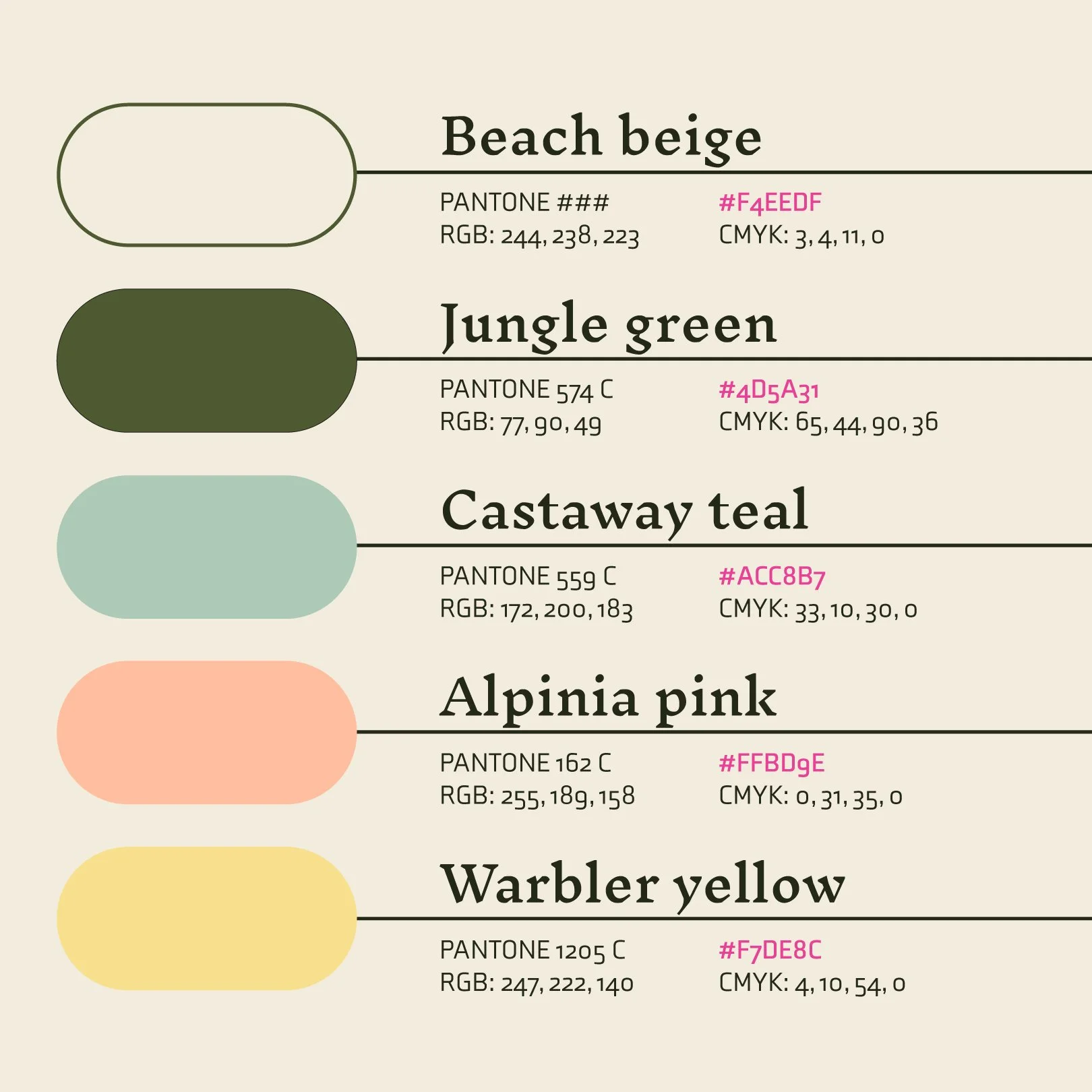
A colorful nostalgia —
After settling on positioning for the brand in its respective market, we created its look feel, and sound — including the name, De Odisea.
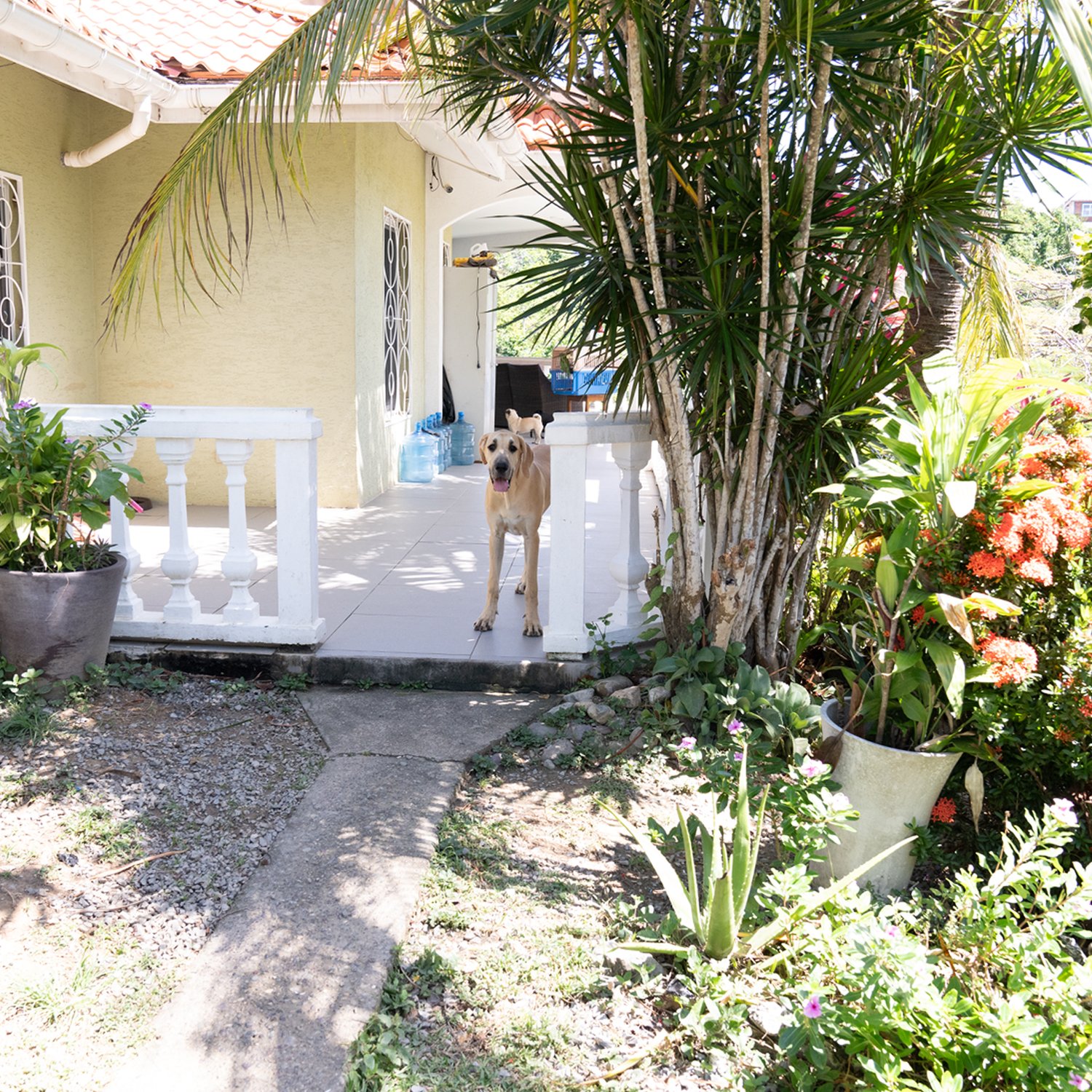
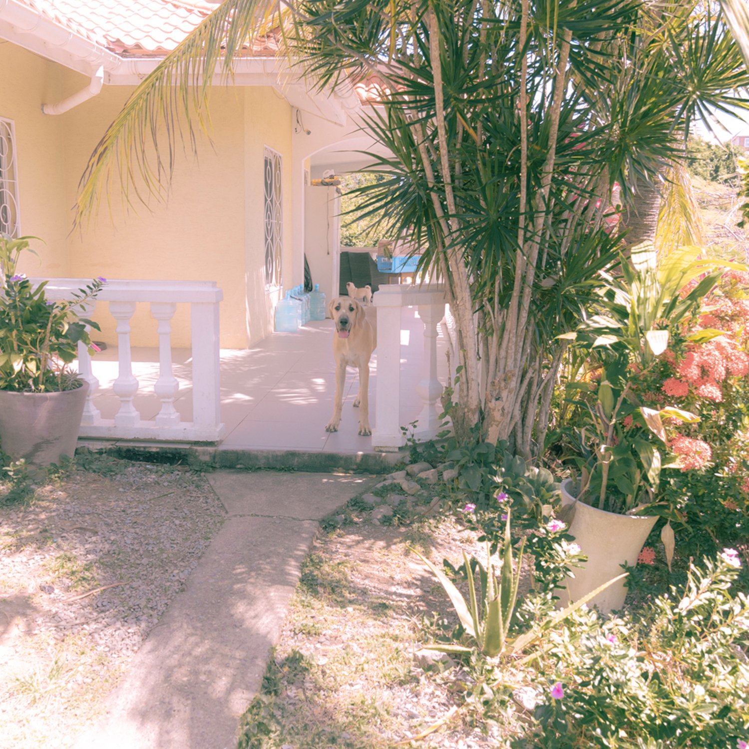
Adding a dreamlike layer —
By blowing out highlights and creating pastel-like undertones in the color palette, we made the photography feel more surreal.